project background
Each Fall, AppDirect hosts its annual Partner Summit. Through panel discussions, and keynote talks, this conference facilitates networking and connections between AppDirect, its clients, and third-party developers. Over the years, the event has grown from 50 attendees to more than 500. The 2014 event was marked by an increase in the stature of the event, and required a significant amount of design support.
The design department's primary responsibility was the design, develop and apply an identity that would help to establish the stature of the event.
Approach
AppDirect's products act as the invisible go-between for marketplace operators, developers, and end-consumers. With that in mind, it was important to develop an identity that didn't put the AppDirect name front and center.
The identity system I designed is built upon a simple logo, and color palette. At the center of the logo, a glyph representing the globe (and all the places our partners come from) sits at a 23.5º tilt. This angle references not only Earth's actual axial tilt, but the angle at which the base of the AppDirect logo also sits. It was a nice detail that probably goes unnoticed, but subtly ties the event's logo to the company running things behind the scenes.
ROLE
- Logo design, web, illustration, identity development and application, design direction
NOTES
- Produced at AppDirect, with Carolyn Cuykendall
Applying the Identity
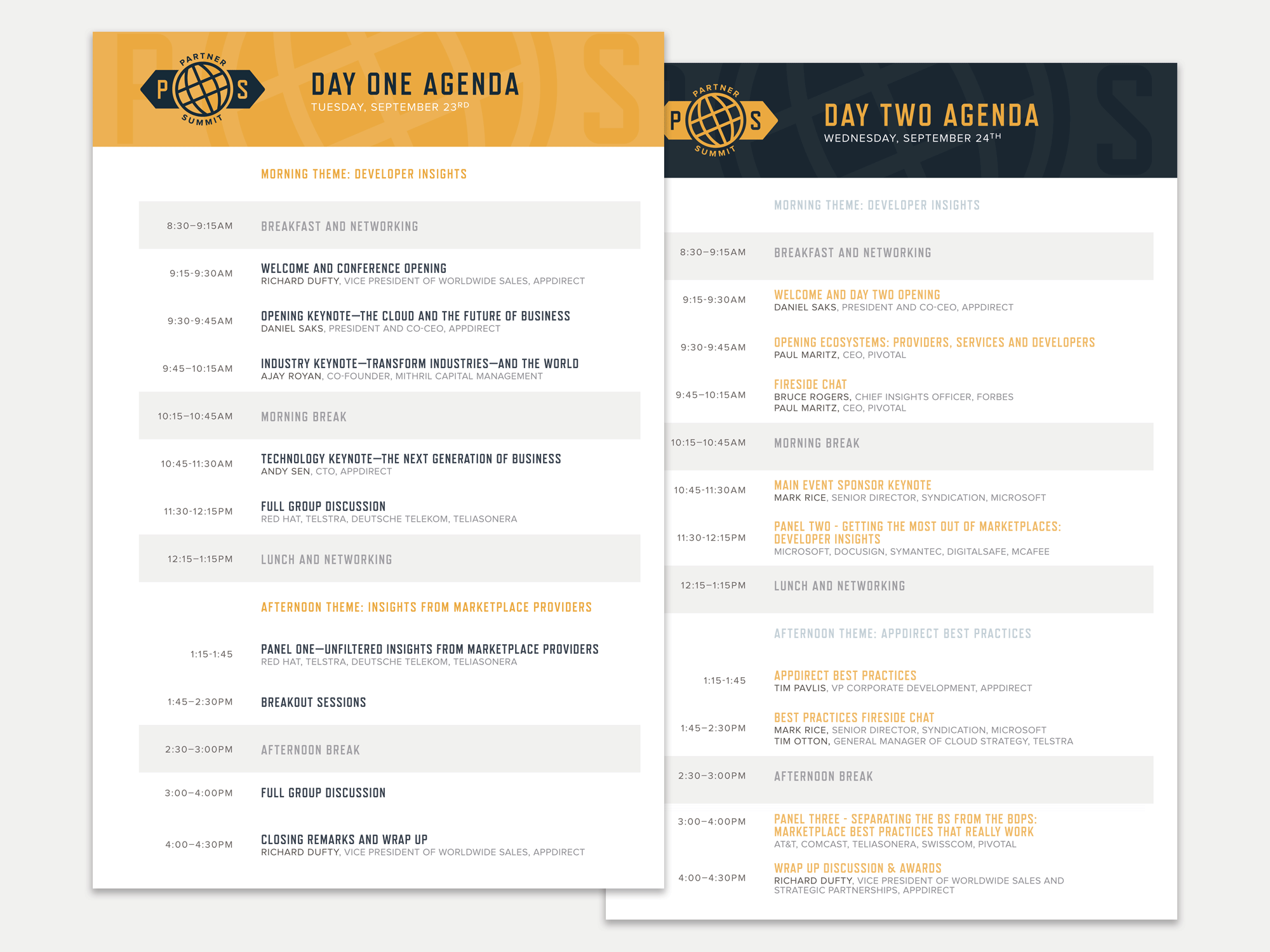
From printed agendas, to guest badges, t-shirts, intro videos, and banners placed all around the venue, the identity system I developed found a variety of applications.


