project background
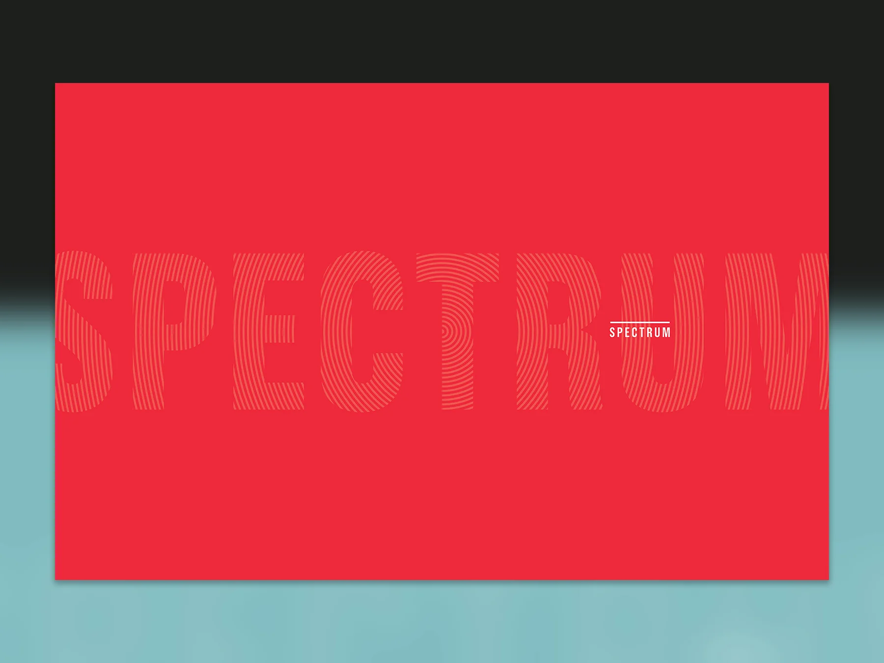
The AppDirect yearbook has grown from a last minute idea that barely got off the ground into an annual chronicle of a year in the life of our company and fellow employees. After creating the first two editions of the AppDirect yearbook, the biggest challenge for the 2015 edition was to keep it fresh, and allow for it to evolve.
Approach
This year's project felt particularly special to me, and gave me the opportunity to play an integral role in shaping the look and feel of the final product. From the outset of this project, I led a series of meetings with the other designers, and our photographer to discuss our thematic and stylistic goals. Those discussions became the basis for some really excellent photography that anchored the visual design.
In addition to designing the cover, and establishing the design templates and style guide, I also contributed a written article, and a few photos.
ROLE
Design and layout, concept development, art direction, copywriting
NOTES
7" x 9" perfect-bound book, 356 pages, produced at AppDirect
Designing The Cover
Bound in holographic foil paper, much of the book's front and back covers are intentionally obscured by thick, black board. The boards contrast nicely with the portions that remain exposed, and serve as a ground to accommodate the subtly embossed title, which runs vertically down the book's face.
The exposed portions of the cover take on a different character depending on the way the light hits it, which lends a really dynamic feel to an otherwise static object.


